unimo is a universal spatial intelligence platform for temporary sites (for example: construction, events, festivals, TV and film).
I've been embedded with them since three weeks before their industry launch as their fractional Head of Brand.
When unimo came to me, they had an awesome product but nothing else. No name, brand, messaging, or marketing materials.
Three weeks later I'd delivered all of it, ready for their first expo.

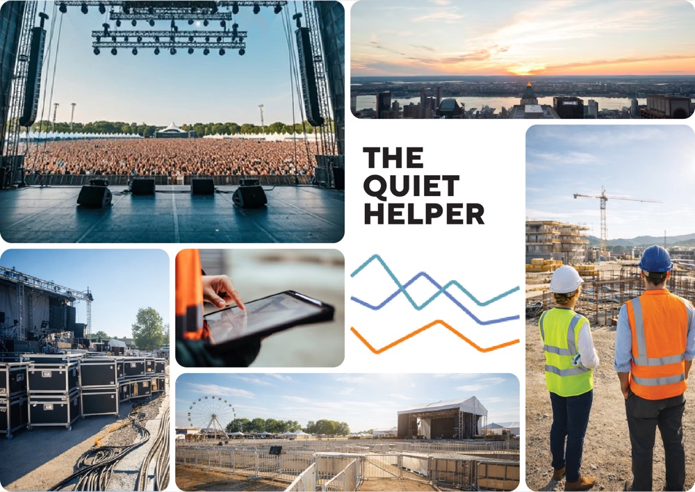
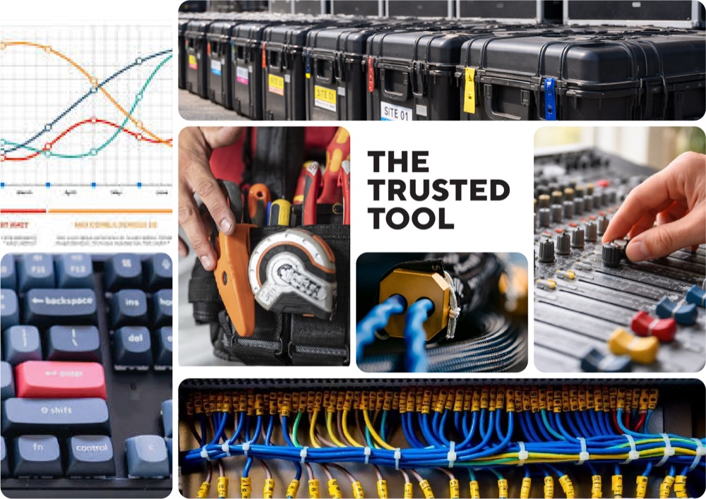
Due to the slightly mad time constraints, I knew we needed to lock a creative direction fast to make sure we didn't run too far in the wrong way.
I presented these three. unimo chose The Quiet Helper, and that's what we ran with.
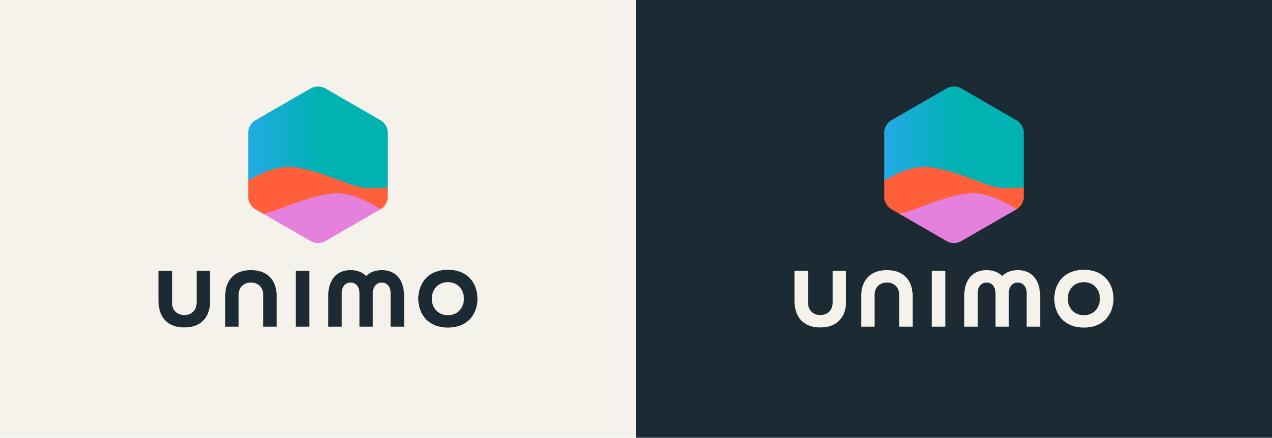
The unimo identity system: stacked lockups, for dark and light backgrounds.
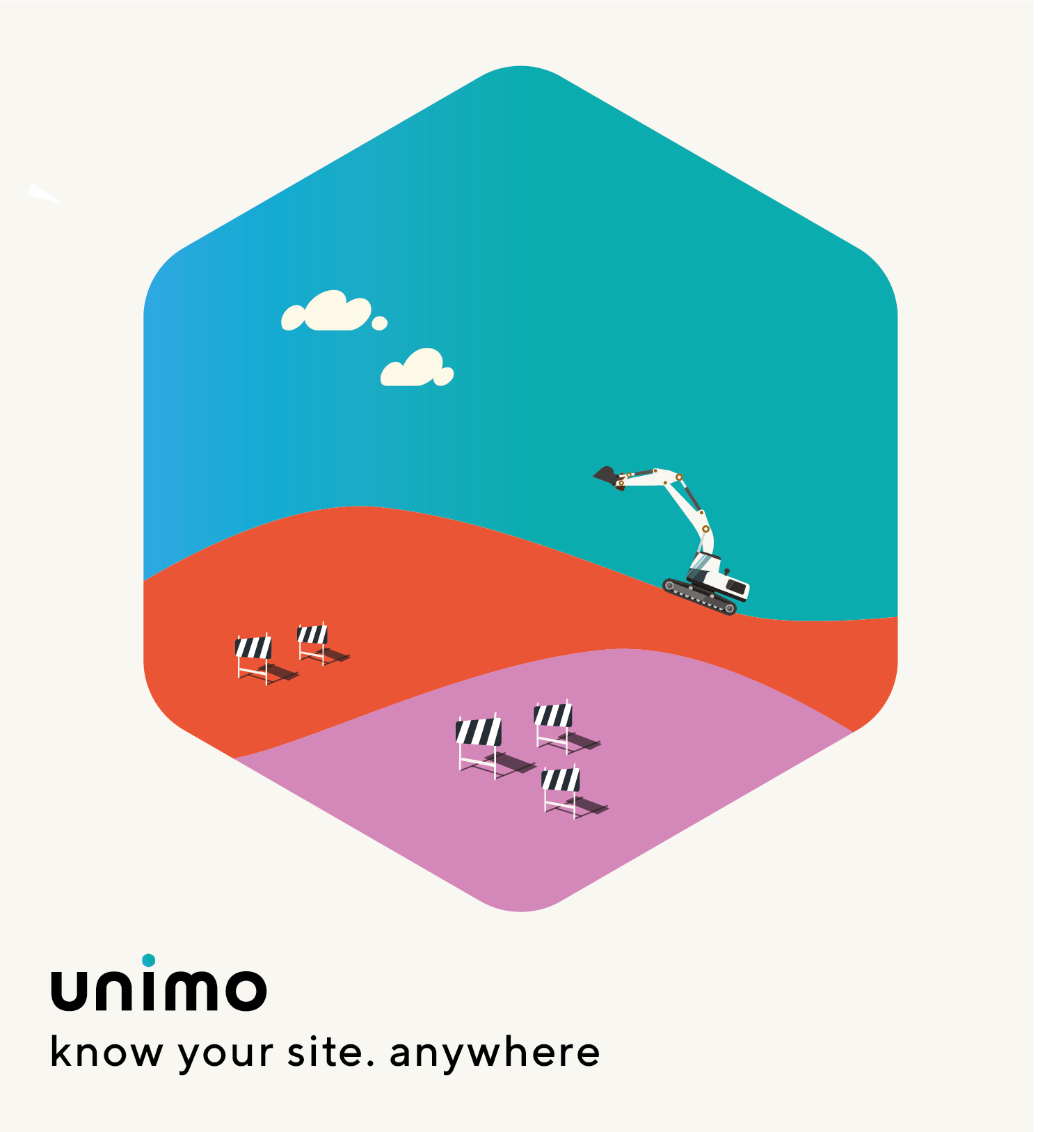
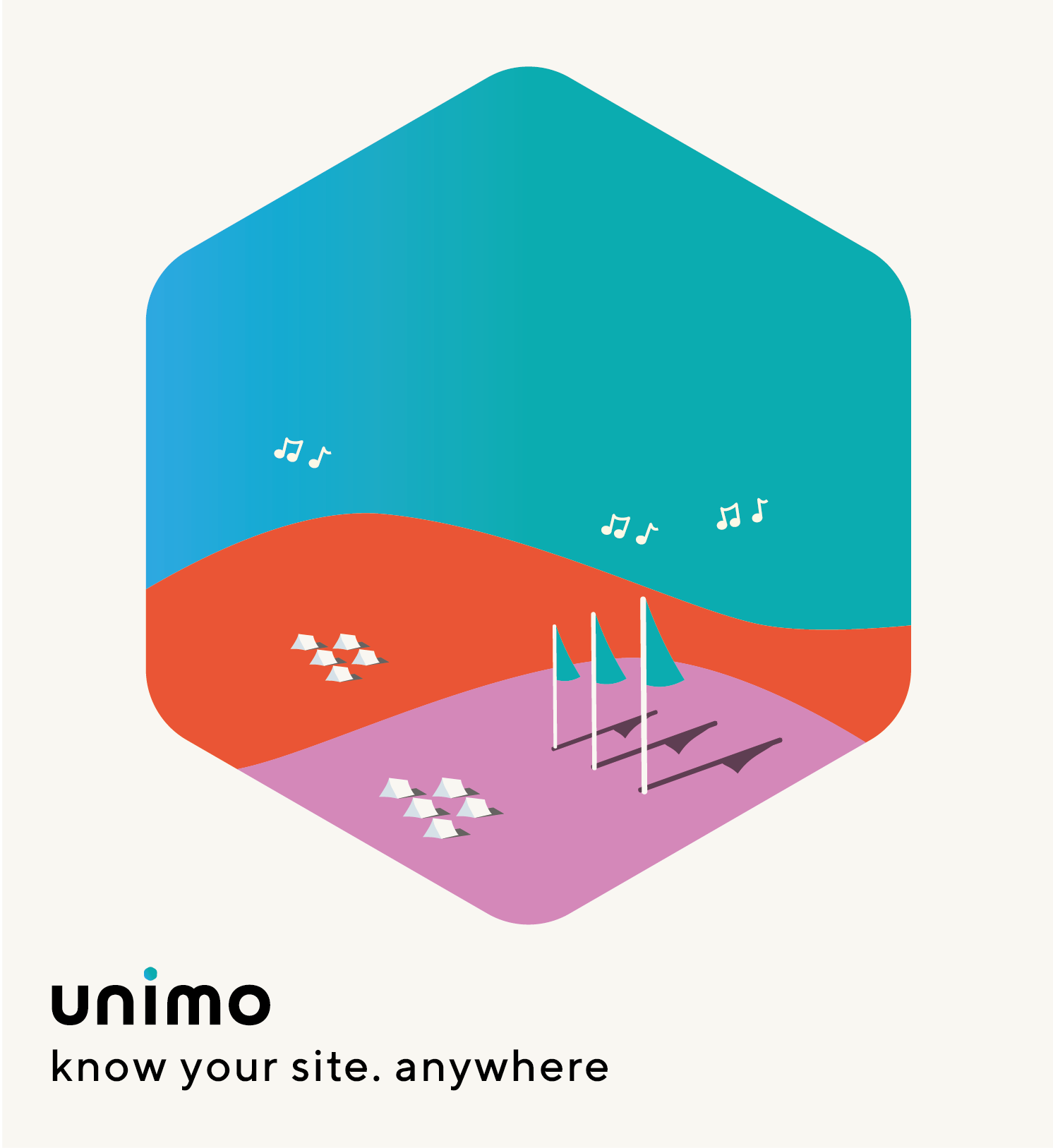
I wanted to make custom illustration a core part of the visual system.
These two posters show the illustrations working across two of unimo's key industries. Isometric to nod to the tech, softened with golden-hour warmth to humanise it. Long shadows, stylised but human.
Not a pixel of corporate Memphis in sight (bleurgh).
A few months later I designed the stand and all materials for UK Construction Week London.
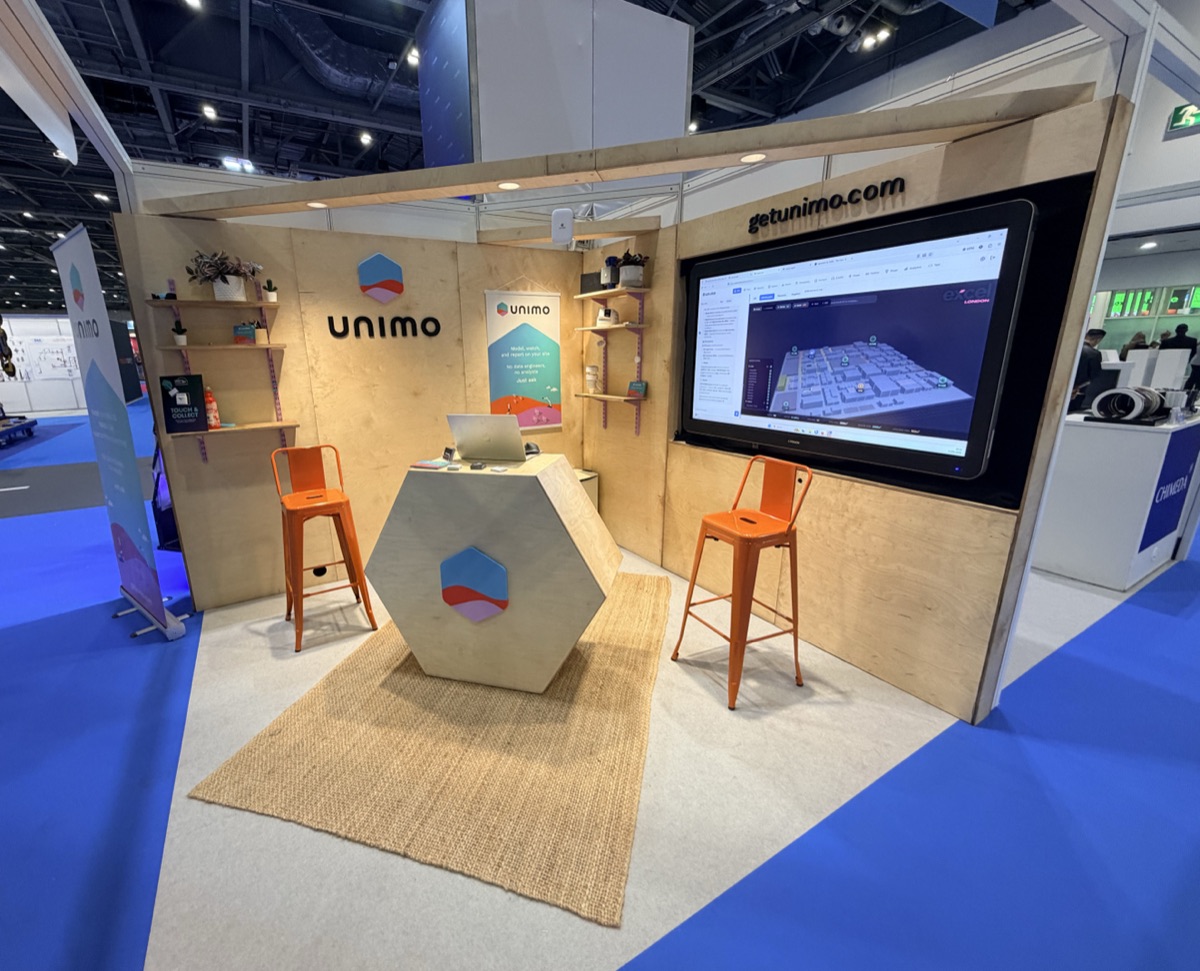
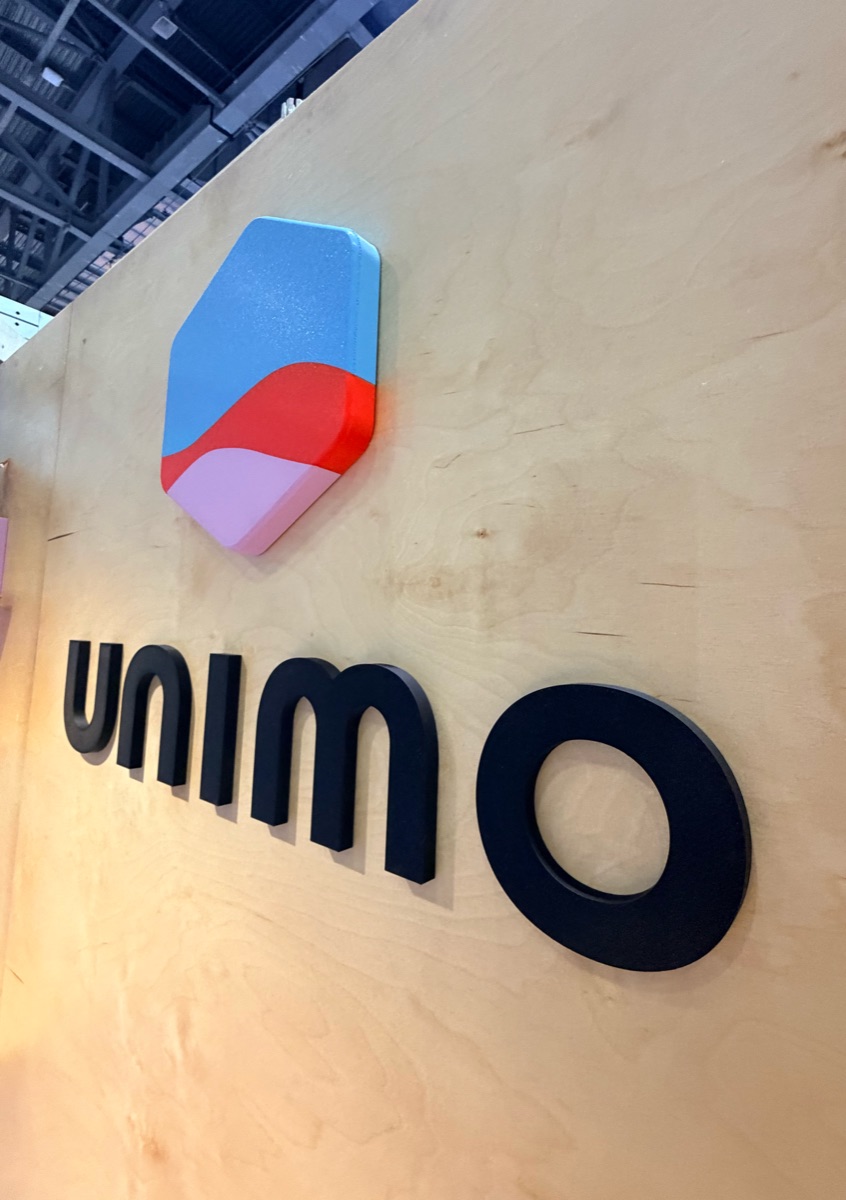
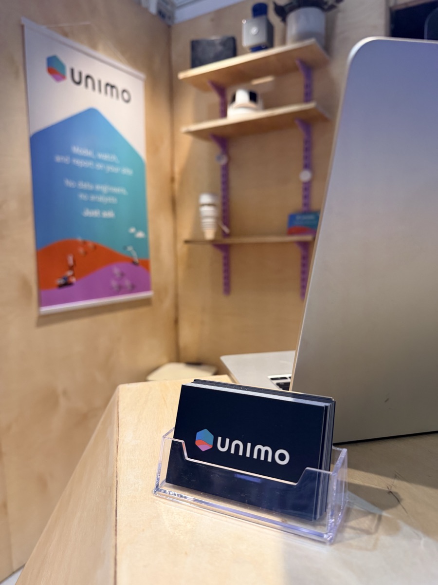
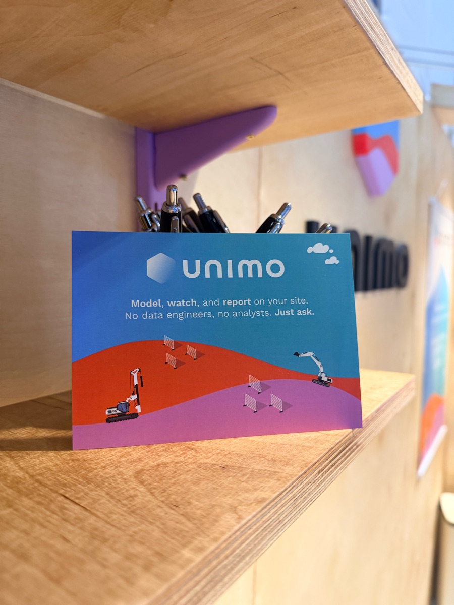
I designed every element of this stand: the wooden shell down to the varnish finish, the shelf uprights colour-matched to the company logo, even down to the coasters we used.
Then I rocked up with a drill and my safety boots and built it.
(Do you know how heavy a 65-inch touchscreen is? I do.)
I worked as a brand ambassador for three days on the stand, talking about the product with potential prospects and telling the team off for leaving coffee cups on the counter.