Driller Queens was a queer feminist trades platform based in Berlin. The first handyman service designed for women and LGBTQIA+ customers, staffed by an 85% FLINTA craftspeople team. I founded it and ran it for six years, and was the brand strategist, designer, copywriter, messaging lead, and web designer. As well as, in true startup fashion, every other department.
For Driller Queens, the tone of voice was our main weapon. Cheeky, sharp, unapologetic, and teetering riiiiight on the edge of what was appropriate.
Also, this was all created pre-AI. I know, vintage right?

These were very much beloved by our customers and community. I also personally loved handing them out at conferences and confusing the poor tech bros.
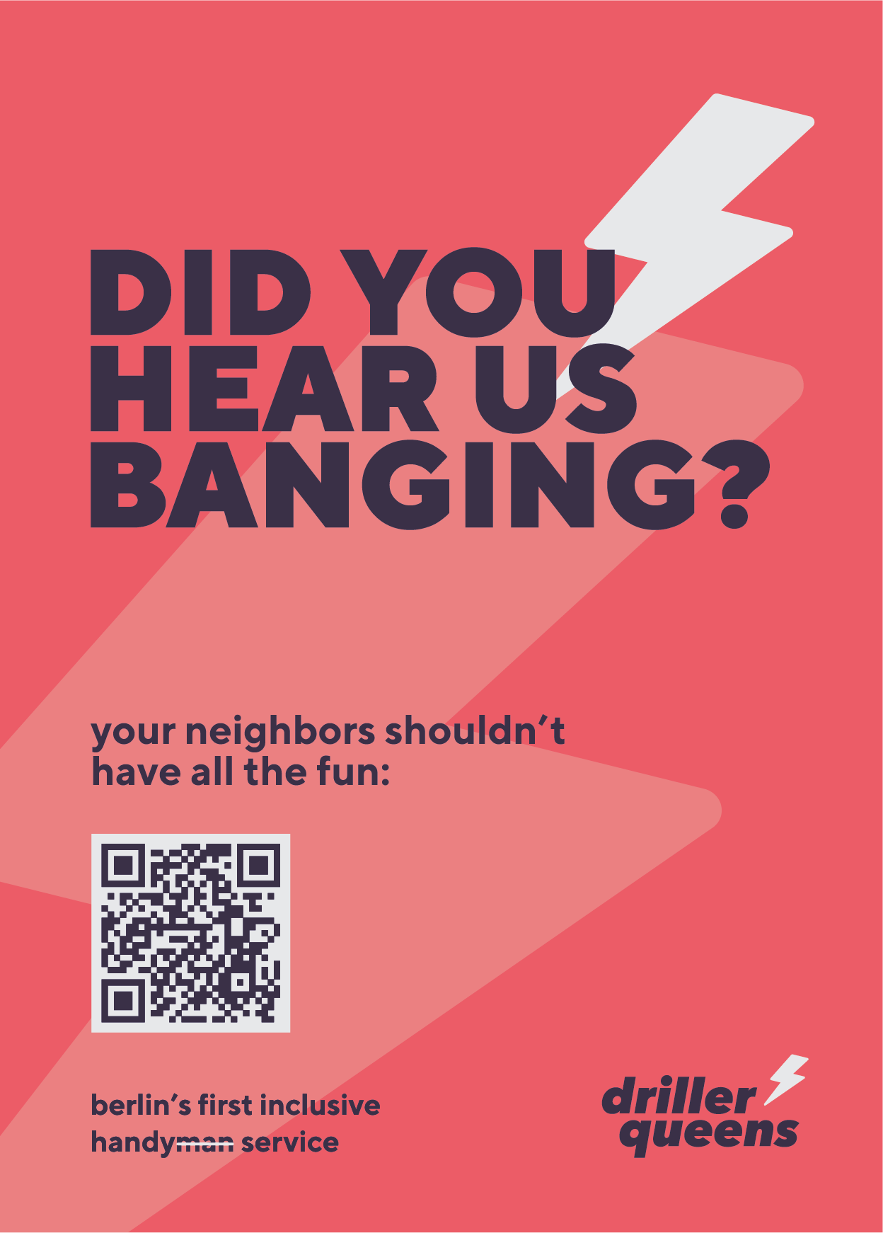
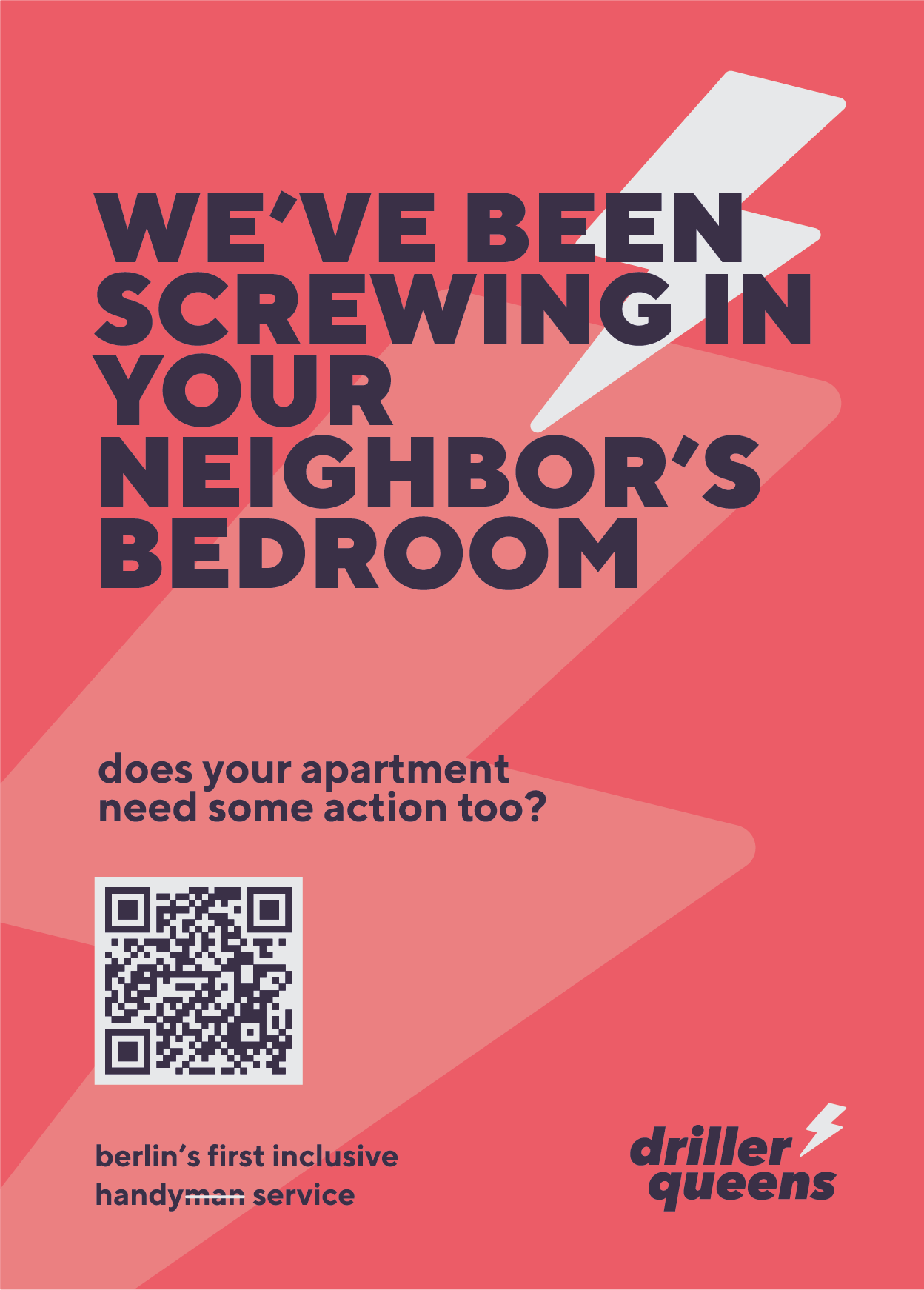
Every campaign was mine end to end: strategy, copy, design, distribution.
The posters above went out with the crafts team and were taped up in hallways after every job. We were careful to only target buildings where our sense of humour would be appreciated. (We didn't put many posters up in Charlottenburg.)
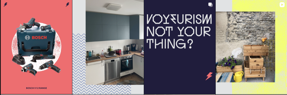
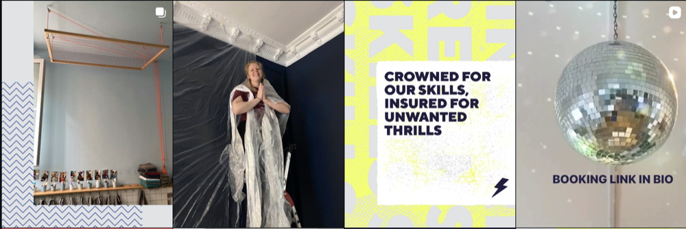
Together with our social media manager and a visual refresh from Mimosa, all content was created in-house. Content strategy, visual language, and community management were mine.
It was really fun to work on such a playful, Berlin-centric creative. Turns out Berliners love a darkroom reference or two. Who'd have thought it?
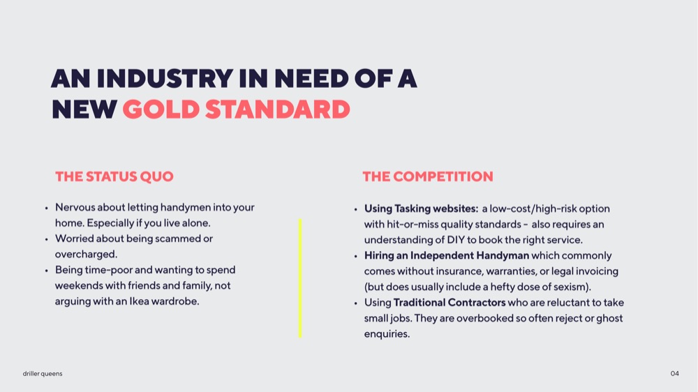
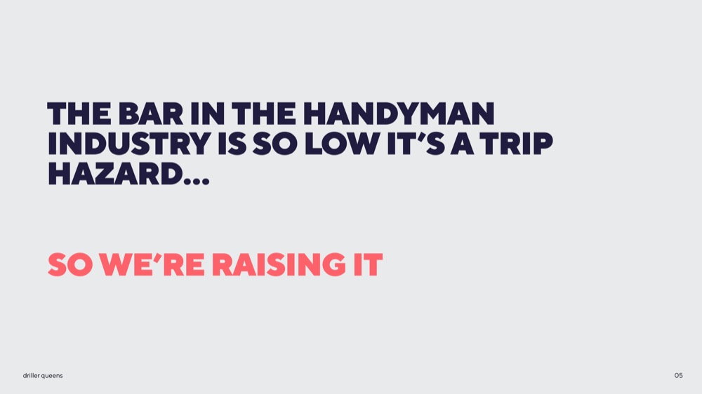
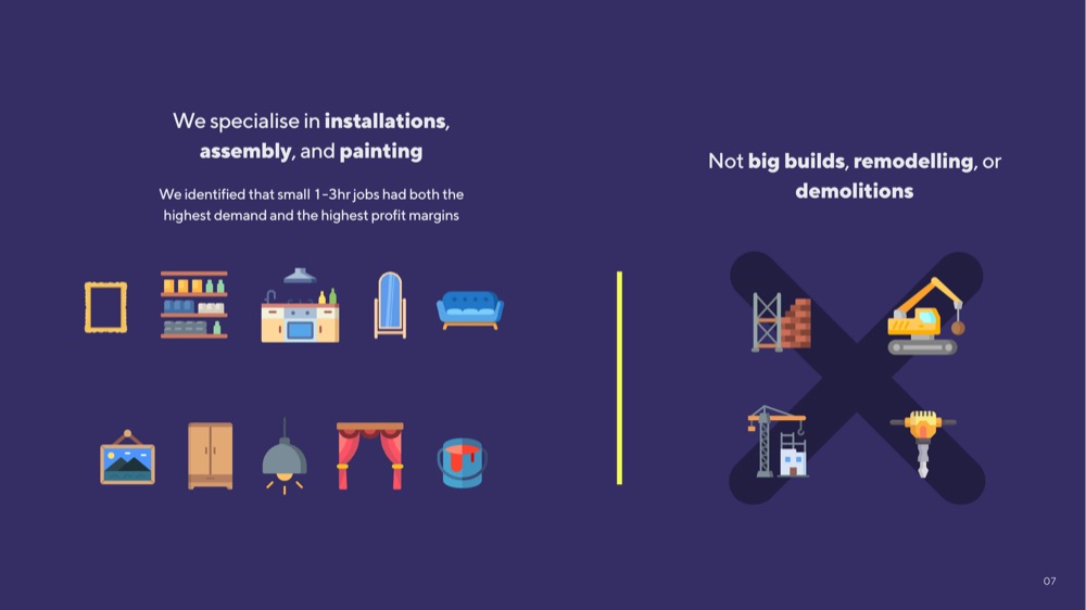
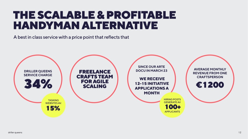
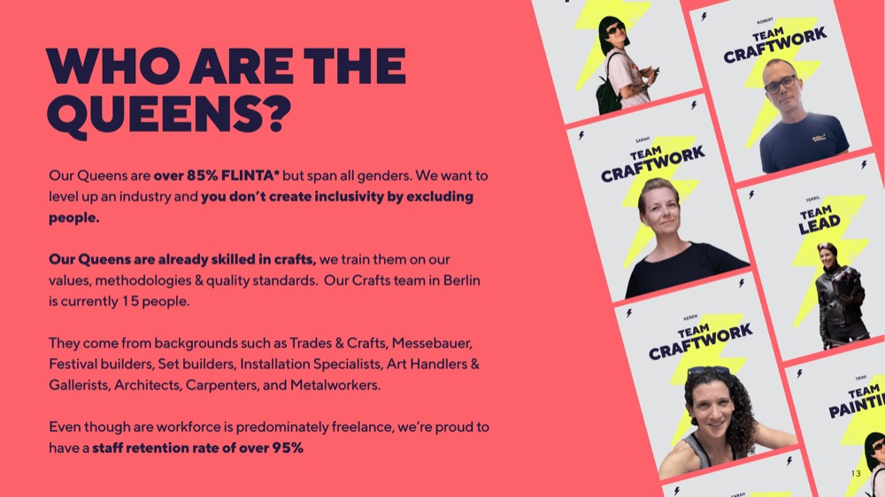
The Driller Queens pitch deck got up to version ten, including two complete rewrites and redesigns. All mine: weeks of research, all the numbers (a challenge and a half for someone this wildly dyscalculic), design, copy, structure.
The thing I like about it: it had to be more corporate and professional than the rest of our brand work, but you can still hear our voice in it. We just dialled the sass down a little bit to keep the VCs happy.